29 July 2020
Code
First create a DataFrame for plotting
# Import libraries
import pandas as pd
import matplotlib.pyplot as plt

# Create a DataFrame
df = pd.DataFrame({
    'animal': ['cat', 'dog', 'deer', 'goat'],
    'weight': [5,30,60,50], # in pounds
    'height':[10, 40, 30, 15] # in inches
})
Create a Bar plot
# Create a bar plot
plt.bar(df['animal'], df['weight'])

# Add labels
plt.title('Animal weight')
plt.xlabel('Animal')
plt.ylabel('Weight')
plt.show()

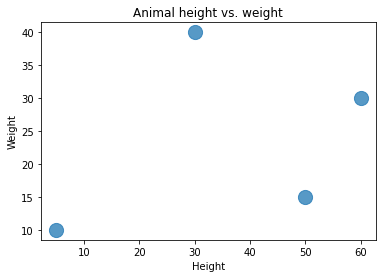
Create a Scatter plot
# Create a bar plot
plt.scatter(df['weight'], df['height'], s=200, alpha=0.75) # s:size of dot; alpha=transperancy of dot

# Add labels
plt.title('Animal height vs. weight')
plt.xlabel('Height')
plt.ylabel('Weight')
plt.show()
Create a Line plot
# Create a bar plot
plt.plot(df['weight'], df['height'], color='b', marker='o', markersize=10, markerfacecolor='red')

# Add labels
plt.title('Animal height vs. weight')
plt.xlabel('Height')
plt.ylabel('Weight')
plt.show()

