29 July 2020
Code
First create a DataFrame for plotting
# Import libraries
import pandas as pd
import matplotlib.pyplot as plt

# Create a DataFrame
cat_mean, cat_std = 5, 1
dog_mean, dog_std = 15,1
df = pd.DataFrame({
    'cat_weight': np.random.normal(cat_mean, cat_std, 1000), # in lbs
    'dog_weight': np.random.normal(dog_mean,dog_std,1000) # in lbs
})
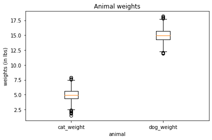
Create a Box plot
# List of columns to plot
cols = [df['cat_weight'], df['dog_weight']]
labels = ['cat_weight', 'dog_weight']

# Create plot
plt.boxplot(cols, labels=['cat_weight', 'dog_weight'] )

# Add labels
plt.title('Animal weights')
plt.xlabel('animal')
plt.ylabel('weights (in lbs)')
plt.tight_layout()
plt.show()
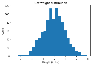
Create a Histogram
# Create plot
plt.hist(df['cat_weight'], bins=25)

# Add labels
plt.title('Cat weight distribution')
plt.xlabel('Weight (in lbs)')
plt.ylabel('Count')
plt.show()
Create a Histogram with density curve
# Histogram
count, bins, ignored = plt.hist(df['cat_weight'], 25, density=True)

# Density curve
plt.plot(bins, 1/(cat_std * np.sqrt(2 * np.pi)) * np.exp( - (bins - cat_mean)**2 / (2 * cat_std**2) ),
          linewidth=2, color='r')
plt.show()

# Add labels
plt.title('Cat weight distribution')
plt.xlabel('Weight (in lbs)')
plt.ylabel('Density')
plt.show()

